Physical Address
304 North Cardinal St.
Dorchester Center, MA 02124
Physical Address
304 North Cardinal St.
Dorchester Center, MA 02124

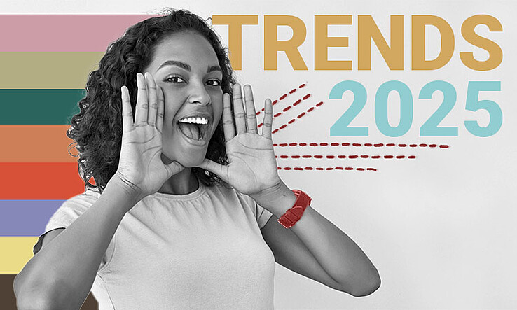
Color is more than just a visual element—it reflects mood, personality, and cultural shifts. Every year, designers, brands, and creatives look to color trends to inspire everything from fashion and interior design to digital media and branding. As we step into 2025, the conversation around colors is more dynamic than ever, centering on two distinct trends: bold, vibrant palettes versus muted, soft tones. Each offers a unique way to express creativity, mood, and style, but choosing the right palette can define the feel of a space, product, or visual identity. Let’s explore the 2025 color trends and how these contrasting palettes are shaping the world around us.
Bold colors are dominating the creative landscape in 2025. These are bright, energetic shades that demand attention and exude confidence. Think vibrant reds, electric blues, neon greens, and rich purples. Bold palettes are no longer limited to fashion runways or graphic designs—they are making their way into home décor, technology, and branding.
One of the key reasons bold colors are trending is the growing desire for self-expression. In a world increasingly defined by digital communication and social media, people want to stand out. Bold colors help create impactful statements, whether it’s a feature wall in a living room painted in fiery red or a tech gadget available in a neon palette.
Brands are also embracing boldness. Vibrant colors convey energy, optimism, and innovation. Tech companies, lifestyle brands, and even food packaging are using bold hues to capture attention instantly. The psychology of color plays a crucial role here—red evokes excitement, yellow suggests happiness, and blue promotes trust. By choosing bold palettes, brands can create memorable experiences that resonate emotionally with audiences.
Fashion and beauty are also leaning into this trend. Designers are experimenting with color blocking, mixing bright, contrasting shades in a single outfit. Makeup brands are launching vivid eyeshadow palettes and lip colors that encourage self-expression. The message is clear: bold is not just a trend—it’s a statement of confidence and individuality.
On the opposite side of the spectrum, muted palettes are gaining popularity for their subtlety and sophistication. These include soft pastels, earthy tones, and desaturated hues like warm beige, dusty rose, sage green, and soft grey. While bold colors grab attention, muted shades create a sense of calm, balance, and understated elegance.
The rise of muted palettes is closely linked to the growing focus on wellness, mindfulness, and sustainability. In our fast-paced digital world, people are seeking serenity and comfort, and muted colors provide a visual retreat. Interiors designed with muted palettes feel cozy and inviting, perfect for spaces where relaxation is the goal. Similarly, fashion using these tones emphasizes timelessness and versatility rather than making a loud statement.
Muted colors are also ideal for brands that want to convey sophistication and reliability. Many luxury brands, wellness products, and eco-friendly companies are incorporating muted tones into packaging and digital presence. These colors communicate a sense of restraint and thoughtfulness, appealing to consumers who value quality over flashy appeal.
Digital designers, too, are turning to muted palettes for user interfaces. Soft colors reduce visual fatigue, improve readability, and make apps or websites feel more approachable. In a time where screen time is at an all-time high, muted palettes provide a visual comfort zone.
Interestingly, 2025 is not about choosing one over the other—it’s about balance. Many designers are blending bold and muted colors to create depth and contrast. For instance, a muted base with bold accent colors can make a design pop without overwhelming the viewer. This approach allows for creative flexibility while appealing to diverse audiences.
In interior design, combining a neutral palette with pops of bold color can make spaces feel modern yet lively. Fashion designers are pairing muted garments with bold accessories to make outfits more dynamic. Even in digital media, combining muted backgrounds with vibrant call-to-action buttons can improve user engagement.
This interplay between bold and muted colors also reflects the broader cultural mindset of 2025—a desire for both excitement and tranquility. People are embracing contrast, complexity, and nuance, and color trends mirror these societal shifts.
While bold and muted palettes define the 2025 trend landscape, some specific shades are poised to become particularly influential. Bright coral, electric blue, and neon green are expected to dominate bold palettes, bringing energy and optimism. On the muted side, warm taupe, soft lavender, olive green, and sandy beige will be popular for their calming and versatile qualities.
In branding, interior design, and digital media, expect to see combinations of these shades used creatively. The key is to consider context—bold colors for high-energy spaces or digital experiences, muted colors for calm and sophisticated settings.
Color trends for 2025 showcase the exciting tension between bold and muted palettes. Bold colors make statements, inspire confidence, and energize spaces, while muted tones offer calm, elegance, and subtle sophistication. The beauty of this year’s trends lies in the ability to mix and match these palettes, creating designs that are visually compelling and emotionally resonant.
Whether you’re a designer, brand strategist, or simply someone looking to refresh your home or wardrobe, understanding the interplay between bold and muted colors is essential. By embracing these 2025 color trends, you can craft experiences, visuals, and spaces that are not only on-trend but also truly reflective of the emotions and moods you want to convey.